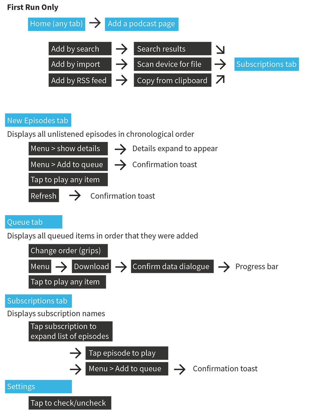
Mobile App Design
Simplified Podcasts
- Timeframe: 4 weeks (Summer 2013)
- Personal role: All work
Podcasting has been growing for years, but has seen little adoption among older and less technical users. Existing podcast apps are complicated tools for power users. Instead of using an application, novices often manage podcast files manually, which is also tedious and error-prone. Listening to podcasts doesn't have to be this difficult.
Goal: Help people get into podcasts by making a simple, unintimidating app to manage their podcast feeds.
Design Questions:
Interviews revealed a few critical insights:
Interview with Jeremiah, 30, Engineering Instructor
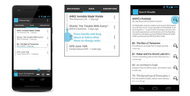
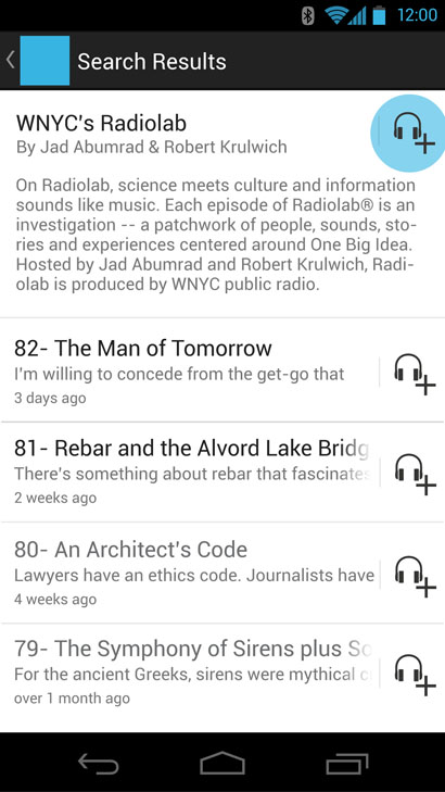
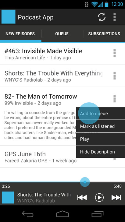
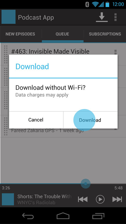
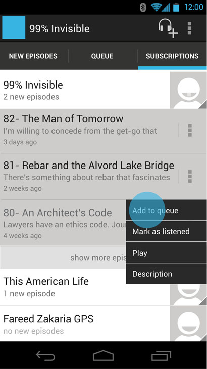
The main task in this app is to find an episode and play it. Any instance of an episode can be played by tapping it once, but some users will choose to queue content for uninterrupted playback of multiple episodes.
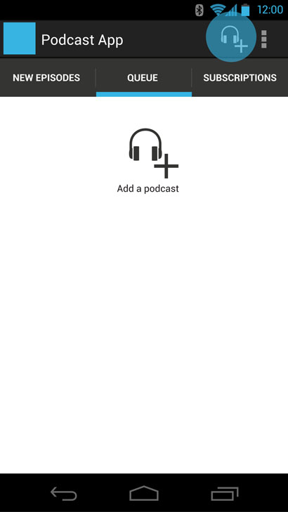
Once set up, the app can be opened and playing a new episode with only one tap. Some users may never leave the new episodes tab. Advanced functionality with the queue and subscriptions tabs are available, yet completely optional.
After working out the conceptual side of task organization on paper, I made a vector based prototype using the Android 4.x Holo conventions. Creating a tab-based navigation helped clarify the organization of tasks. I realized that multi-level navigation in existing apps is the primary source of perceived complexity. My early iterations focused on staying on one view and only switching between tabs.
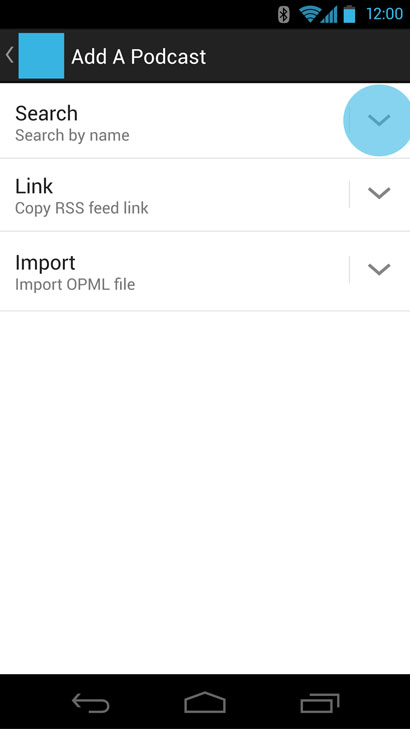
The following wireframes include all the major views of the application without final visual styling.


A limited prototype was created in Axure RP to test the most essential interface elements.
Try the prototype on your mobile device or in a browser. For desktop browsers, use Ctrl - or Command - to zoom out. To view full screen on your mobile device, choose the second option on the left: App Home.
Please note the alternate condition available for first run setup.
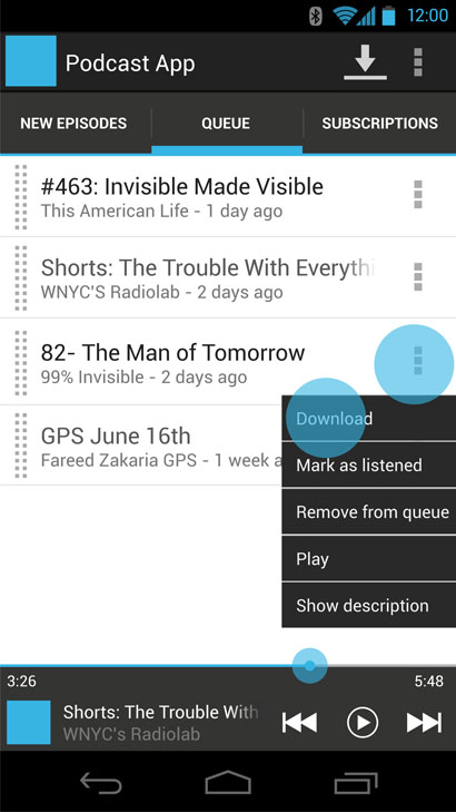
Two major usability issues were present in the queue tab:
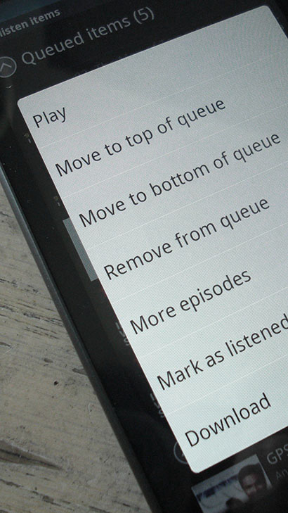
Traditionally, press-and-hold contextual menus have been used to solve both problems.
This approach has multiple issues:
Additionally, user interviews revealed that ordering the queue was often too tedious to be worth setting up, and they chose to manually select the next desired episode after an item had finished. This creates a distraction when driving, a common setting for podcast consumption.
My early approaches focused on bulk actions like "mark as listened" that required multi select. In version 4.x, Android has moved toward a multi-select convention. Multi-select is a powerful function for batch operations and is well established as a convention. Unfortunately, This approach still requires some discovery for tap-and-hold to select convention. Once items are selected, another step is required to apply the desired action. Reordering remains tedious.
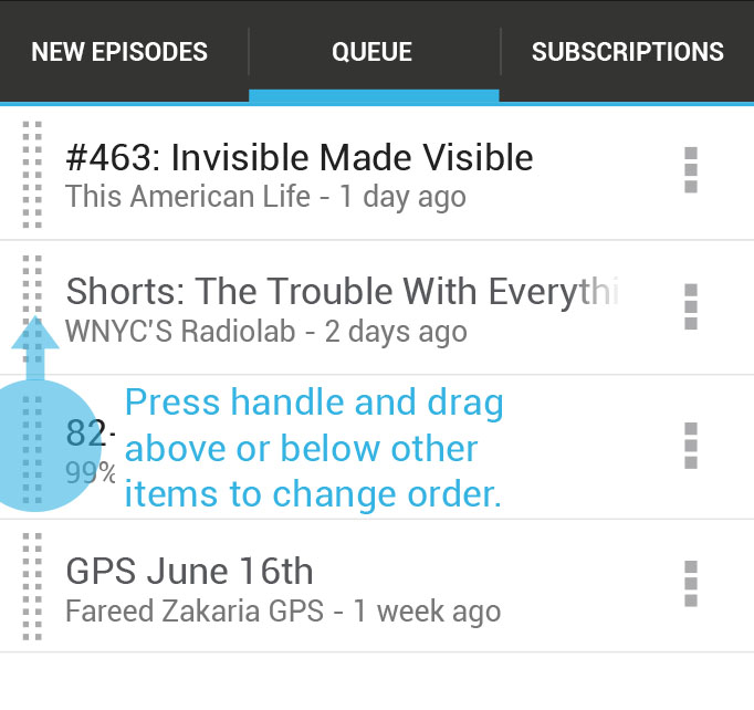
Handles allow quick movement with visual feedback in one step. They are a common convention across both Android devices and web apps. The handles only appear on the queue tab, so the feature is more likely to be noticed. Instant visual feedback is given as items are dragged with a user's touch.
Remaining functions are placed in an overflow menu. The menu is quick to access and in the same part of the screen, making the remaining, less commonly used functions easy to repeat on multiple items.
Findings from user testing with Trevor, a self described podcast novice who is unfamiliar with Android conventions. He used Spotify as a reference point for understanding this app's interface. Tested with prototype v1.0.
Testing with Mark, a power user and frequent podcast listener. "I break podcast apps." Uses Android devices daily, familiar with conventions. Tested with prototype v1.1.